I'm just excited to have be shown in such a wonderful, totally juried exhibit of this quality. My quilt will now travel for a year to other International shows of what I consider, the highest caliber.
Explanation of my quilt design.
The category of the 'Silver Screen' caused me to think of academy award winners, memories of old bill boards, dreams of an ideal movie theater with fine dining and entertainment = a gathering place for movie lovers.
What is more Silver Screen than the Academy Awards? My theater only shows academy award winners. At the moment it is a triple slam: the only 3 movies that won the 5 major academy awards.
Of course on Sunday afternoons the Bistro features a photo fashion show; each week different award winning designers are featured.
On weekends, for the late night folks, Theater 1 shows films where the director won the Oscar.
My bill board advertisement expresses my desires for an ideal theater venue. As well as acknowledging and honoring the award winners. It strives to respond to patrons desires in order to have a viable enterprise.
Techniques used: piecing, raw edge, fusing, photo transfer, printing, and painting.
This is a photo of my whole quilt ~42"x60+" hanging on my quilt wall in my dining room. All of the text/advertisement was made up by me to enhance my idea.

Sketch for the 'movie clip'.

Close up of the raw edge movie clip. I made this using pieces of fabric and fusing them to a background to make the picture. Notice how I needed to change the book. Had it all wrong in the first sketch.

Close up of the close up so that you can see more detail about how I made the piece.

This shows how I blocked the quilt. The layout 'lines of yarn' are the dimensions that it should be according to my guide/plan of what I was doing. You will notice some 'shrinkage'.

Blocking corner closeup.

More about the process of making the quilt for those of you are are not totally saturated.
Fabric ironed and pinned to a board. This is my pallet.

Testing fabric contrast for letters.

Fusing material and fabric for letters. After fusing the fabric to the material, I cut out each letter and then ironed it in place.

Fusing the quilt title letters.


11 comments:
Ann! This is awesome! I can see why it made it into the show. Congrats to you!!!
Ann, This is quite wonderful! Awesome piece.
So delightful! I love your palette board (new idea to me) & all your details. Thanks for sharing and Congratulations!
Enjoy the thrill!
So delightful!
I love your palette board (great idea!) and the other details too.
Thanks for sharing & Congratulations!
Enjoy the thrill!!!
Ann, your quilt is wonderful. And, hearty congratulations on the exhibit.
Carol
Fantastic piece Ann! Love how you shared your wotking methods.
And congradulations!!
Ann, your Claudette Colbert is so good! Such an interesting piece. You did an awsome job! thanks for sharing!
So fun and creative---I love it. Congratulations.
Fabulous quilt! Easy to see why it was selected for the book.
Hi Ann, Beautiful work and congrats for having this wonderful quilt in the 500 book.
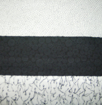
It pleases me that I answered your call for some black and white fabric for this piece. It's beautiful and I'm happy to have helped in such a tiny way.
Diane in NH
I think that an artist's work is the best proof of their dedication to excellence. There are no accidental masterpieces. You are a perfect example of this illustration. Magnificent.
Post a Comment